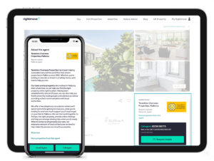
Your new Rightmove Overseas Property Details Page
Drag the slider to reveal the new look
Since we started testing the new-look property listings back in May, we’ve been working hard behind the scenes to refine the design. Based on your feedback, we’ve re-introduced the carousel option on the main property details page. We’ve also added your contact details to the new image and floorplan galleries, making it easier than ever for buyers to contact you.
Here’s a run-through of some of the top features in your new-look property listings. For ideas on how to make the most out of these, you can check out the new Ultimate Listing Guide.
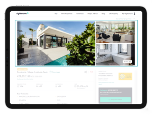
Image & video carousel
The image and video carousel at the top of the property details page gives buyers the option to quickly click through all your images and videos. Any videos you upload will now also appear in the carousel and we’ve added the video icon next to the number of photos, to help make your video content even more prominent.
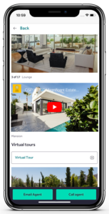
Full-screen image & video gallery
The new full-screen image gallery makes it easy for buyers to scroll through all your photos and videos in one place. It’s particularly useful for the 60% of people who visit Rightmove Overseas on a mobile device, where it’s more natural to scroll through images. The image gallery shows your photos in their original ratio, meaning portrait photos appear at their best. By moving your videos into the main image gallery, they’re easier than ever for buyers to find and watch.
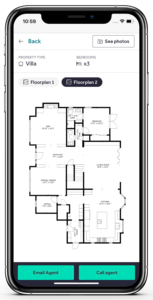
Full-screen floorplan gallery
Buyers told us they want to use floorplans alongside photos to understand the property layout. They can now flick between the full-screen floorplan gallery and the image & video gallery at the click of a button to do just that. We’ll also highlight floorplans in the new “mini-media” reel…
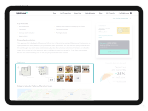
Mini-media reel
This is a new feature which appears just under the key features on your property. It provides buyers with a quick-access point to your floorplans, videos and photos.
Your details
Your logo and contact details now stay on screen as the buyer scrolls down the page to read the property description. Buyers told us that one of the key things that helps them decide to contact an agent is the photos, so we’ve added the call and email options to your full-screen image & video gallery, and the floorplan gallery too, so it’s right there whenever the buyer needs them. Your branch description also shows at the bottom of every property listing, giving you some space to sell yourself.
Now’s a great time to update your property listings to make the most of all the new features. To help you do that, we’ve created a new Ultimate Listing Guide where you’ll find the latest advice based on site performance and buyers feedback. Click below to get started.
